This choice goes beyond looks. Finish affects how a printed piece feels in hand, how well it survives repeated handling, and how those colors translate on a shelf or in a thumbnail online. It can also touch your print budget and turnaround time.
This guide breaks down what separates matte from glossy, where each one performs best, and how to make a confident final call.
Key Takeaways
- Matte gives stationery, reports, and frequently handled pieces a soft, non-reflective finish.
- Glossy adds vibrant, high-contrast color to packaging, menus, and photo-heavy pieces.
- Costs are comparable at standard volumes; premium coatings add expense.
- Your audience, artwork, and handling conditions determine the best finish.
Matte vs. Glossy: Quick Comparison
Before diving into specifics, here's how the two finishes stack up across the factors that matter most to designers and print buyers.
| Factor | Matte | Glossy |
|---|---|---|
| Cost | Comparable to glossy; soft-touch laminates cost slightly more | Standard UV gloss, typically the lower-cost default |
| Visual Appeal | Muted, sophisticated color; non-reflective surface | Vibrant, high-contrast color; reflective shine |
| Durability | Resists fingerprints; can show scuffs over time | Resists moisture and general wear; smudges show more easily |
| Glare/Readability | Low glare in most lighting conditions | Can create glare or hotspots under bright light |
Neither finish wins outright. Matte trades scuff resistance for glare control, while glossy trades fingerprint resistance for color punch.
According to Bookmobile's printing guidance, matte can subdue rich, dark colors, while gloss brightens images and keeps those same tones vivid.
That single detail often decides the whole debate before you even get to category conventions.
What Is a Matte Finish?
A matte finish is a smooth, non-reflective laminate or coating applied over your printed stock. Where gloss bounces light back at the viewer, matte absorbs it, creating a flat, understated surface.
For anyone chasing a premium, understated look, matte delivers exactly that. The finish reads as deliberate rather than flashy.
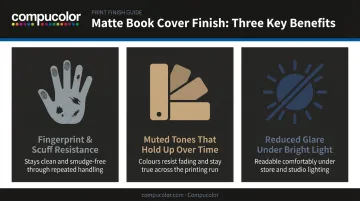
Three practical benefits matter here:
- Fingerprint and scuff resistance reduces the odds you'll need reprints for damaged display copies.
- Muted tones hold up visually after months of handling, without looking worn the way a scratched glossy surface can.
- Reduced glare keeps photography and staged shots looking clean under bright store or event lighting.
Matte Variations Worth Knowing
Not all matte is created equal. Standard matte coating gives you the non-reflective look at a baseline cost. Soft-touch (or silk matte) laminate goes further, adding a velvety tactile layer that people notice the moment they pick the piece up. Bookmobile notes that this soft-touch option carries a higher cost than standard matte lamination, so factor that into your budget if you want the upgraded feel.
Full-service printers, including Compucolor, offer both options as standard finishing choices. Ask to see physical samples before locking in your print run, since the tactile difference is hard to judge from a digital proof.
Use Cases of Matte Finish
Matte tends to dominate in categories where tone and credibility matter as much as visual pop:
- Business cards and stationery - the understated look matches a considered brand voice
- Reports, manuals, and journals - these get handled repeatedly, and matte holds up
- Premium packaging and presentation folders - a matte surface signals authority and restraint
- Planners, menus, and hardcovers - frequent handling favors matte's scuff resistance
Author John Sneeden chose matte for his novel The Signal after weighing feedback from other authors. He wanted his paperback to project a professional, quality appearance, and one reader commented that glossy would have felt less polished on the same design.
This single example doesn't prove a trend, but print buyers report the same reaction across categories: matte often reads as serious craftsmanship.
What Is a Glossy Finish?
Glossy is the shiny, reflective UV or laminate coating you'll recognize from most magazine racks. Where matte flattens light, glossy throws it back, and that reflection is exactly what makes colors pop.
For anyone chasing bold shelf presence or a striking online thumbnail, that's the whole point. A vivid piece in a sea of muted ones gets noticed first.
Several benefits drive glossy's popularity:
- Enhanced color saturation improves how artwork reads in large-format displays and on retail thumbnails
- Smooth, sealed coating adds resistance to moisture and general wear
- Consistent, repeatable results keep color reproduction accurate across large print runs
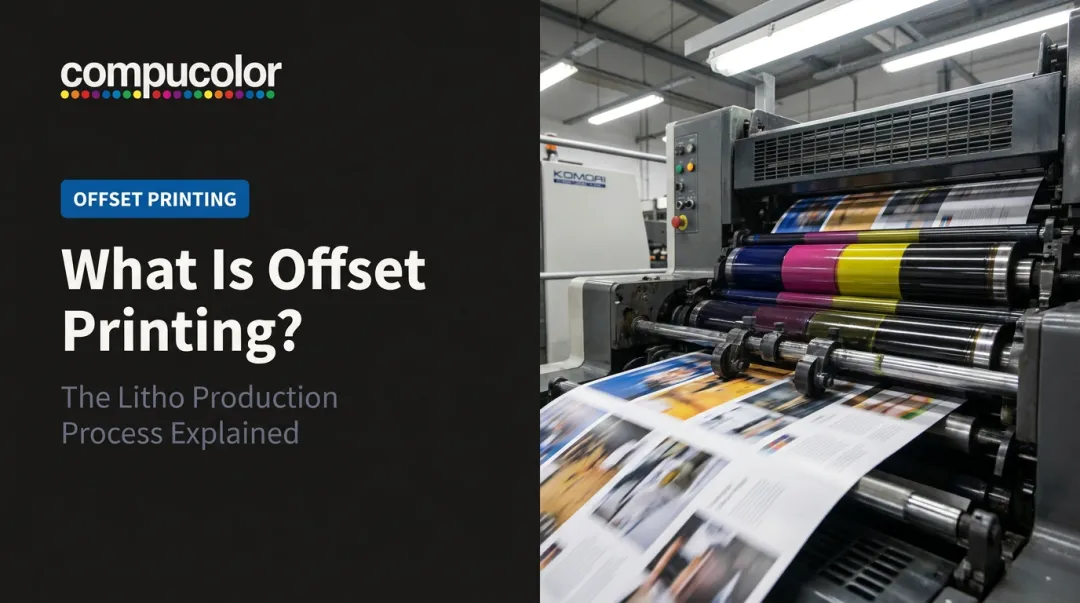
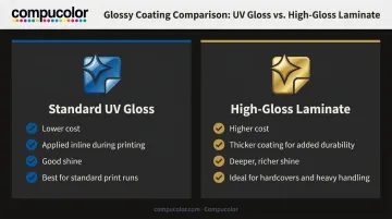
Not all gloss finishes are identical, though. Standard UV gloss coating is the default option most digital and offset printers apply automatically, and it's typically the lower-cost route. At Compucolor, we apply this coating inline using our Komori press with its integrated H-UV coater, keeping turnaround fast without sacrificing shine.
High-gloss laminate, often used on rigid and heavier stocks, adds a thicker, more durable coating with an even deeper shine. It costs more but holds up better on pieces that will see heavy handling in retail or public settings.
Use Cases of Glossy Finish
Glossy earns its reputation in categories where imagery carries the marketing weight:
- Children's books and illustrated titles - bright illustrations need that saturated pop
- Menus, cookbooks, and photo prints - food and photography look richer under gloss
- Posters, flyers, and retail signage - bold artwork and color benefit from the shine
- Product packaging and catalogs (retail, promotional) - dramatic imagery sells on impact
Industry data backs this up, showing illustrated titles, cookbooks, and art or photography work as the most common gloss-laminated categories in print runs today. Magazine covers and marketing collateral built around vivid imagery follow the same logic: shine sells when the image itself is the hook.
Matte vs. Glossy: Which Finish Should You Choose?
Here's the honest answer: there's no universal winner. The right choice comes down to five factors.
- Purpose and tone - does your piece read as understated or attention-grabbing?
- Target audience - what will people expect to see and feel?
- Visual design elements - is your artwork text-driven or image-heavy?
- Budget - standard coatings vs. premium laminates
- Handling and display - will this piece sit on a shelf, travel in a bag, or get passed around repeatedly?
When Matte Makes Sense
Choose matte if you're prioritizing sophistication, credibility, and comfortable long-term handling. Stationery, reports, and premium packaging all benefit from that understated, professional look, especially if the piece will be handled often over time.
When Glossy Makes Sense
Choose glossy if vibrant visuals and shelf or online attention matter more than subtlety. Illustrated titles, photo-heavy pieces, and categories with bold artwork are built for glossy's saturation and shine.
Sneeden's experience with The Signal illustrates this decision process well. He gathered informal input from other authors, weighed concerns about curling and texture, then picked matte specifically because it matched the tone he wanted his project to convey.
No massive sales study backed the decision. It came down to matching finish to intent, which is exactly the process worth repeating for your own project.
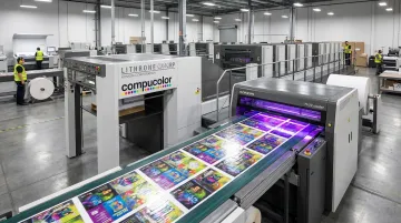
Production partners matter here, too. A printer with advanced coating technology can apply matte or glossy finishes consistently across an entire print run, without the inconsistency that shows up with lower-quality equipment.
At Compucolor, our Komori press with an H-UV coater applies precise, repeatable finishes at scale. Our in-house creative team can also help you test mock-ups in both finishes before you commit to a full run.
If you're on the fence, request proofs in both finishes before finalizing your print files. Compucolor's fast turnaround and straightforward online file submission make it simple to test a small run first, so you're deciding based on how the actual piece looks and feels, not a screen preview.
Conclusion
Matte and glossy each solve different problems. Matte offers subtlety, credibility, and comfortable handling for pieces people will hold onto for a while. Glossy offers vibrancy and shelf presence for pieces that need to grab attention through imagery alone.
The decision isn't about finding the "better" finish. It's about matching the coating to your project, your audience's expectations, and how the piece will live in the world, whether that's a retail shelf, a coffee table, or a backpack.
Order proofs of both finishes before locking in your print files. A decision made on-screen rarely matches the one made with a physical copy in hand. Ask your printer, such as Compucolor's bindery and finishing team, to run sample copies before your final print run.
Frequently Asked Questions
Which is better, matte or glossy?
Neither is universally better. Matte suits sophisticated, frequently handled pieces like stationery and reports, while glossy suits vibrant, visually driven work like packaging and photo prints. The right choice depends on your project and audience.
Does a glossy or matte finish cost more to print?
Standard costs are typically comparable between the two finishes. Premium soft-touch matte laminate or specialty spot-UV effects can add modest additional cost.
Can I combine matte and glossy finishes on the same printed piece?
Yes. Spot-UV techniques apply a glossy coating over a matte base to highlight specific elements, like a title, image, or logo, creating contrast and visual interest.
Which finish is best for image-heavy work like packaging or photo prints?
Glossy is the preferred choice for these categories. It enhances color vibrancy, making illustrations and food photography pop in a way matte can't replicate.
Does the finish affect how long a printed piece lasts?
Finish does affect durability, though the differences vary. Matte resists fingerprints and scuffs better under frequent handling, while glossy resists moisture but shows smudges more easily over time.
How do I decide between matte and glossy for my project?
Evaluate your project's tone, your target audience's expectations, and how image-heavy your artwork is. Then order physical proofs of both finishes before finalizing your print run.