
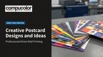
That's the real opportunity with postcard marketing: a well-designed piece doesn't just get read once. It sticks around.
The problem is that most postcards never earn that second life. Generic templates, cluttered layouts, and forgettable messaging mean the piece gets tossed before anyone reads the offer. This guide breaks down the design elements, creative themes, interactive trends, and industry-specific ideas that turn a routine mailer into something worth keeping.
Key Takeaways
- Bold contrast and a single clear message beat cluttered layouts every time.
- Direct mail earns 4.4 interactions and 7 days in the home, far outlasting email.
- QR codes, scratch-offs, and personalization work best when built into the design, not bolted on.
- Real estate, nonprofits, and higher ed each follow distinct postcard playbooks worth borrowing.
- Paper stock, coatings, and printer certifications affect how your design looks once printed.
Why Creative Postcard Design Still Works in Direct Mail
Digital fatigue is real. Inboxes are jammed, ad blockers are everywhere, and most banner ads get ignored within milliseconds. A physical postcard doesn't have to compete with forty other open tabs.
According to the ANA's 2023 Response Rate Report, direct mail sent to house lists generated a 15.6% response rate, compared to lower figures typically seen across digital channels (ANA, 2024). The survey sample was small, so treat this as a directional benchmark rather than a guarantee.
Still, it points to something print marketers already sense: people engage differently with physical mail.
The Second Life Phenomenon
JICMAIL's Q4 2024 panel tracked nearly 10,000 mail pieces (JICMAIL, 2025). The average piece:
- Received 4.4 interactions over its lifespan
- Stayed in the home for 7 days
- Accumulated 133 seconds of attention across four weeks
That's not a single glance. That's a piece of mail getting picked up, moved, looked at again.
This is exactly why creative design matters so much. A postcard people find visually interesting is far more likely to end up displayed on a fridge or filed away than one that reads like every other insurance mailer in the stack.
Even traditionally conservative industries have caught on. Dental practices are mailing postcards with dry humor. Law firms are using bold color and playful headlines instead of stiff, corporate templates. In a crowded mailbox, the unexpected wins the second look.
Essential Design Elements That Make Postcards Impossible to Ignore
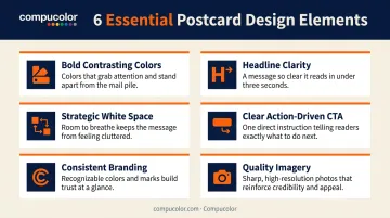
Before jumping into themes and trends, it helps to nail the fundamentals. USPS design guidance and print industry best practices point to a handful of elements that consistently separate postcards that get read from ones that get tossed.
- Bold, contrasting colors – High contrast palettes and uniform brand colors help a card stand out against the beige envelopes and generic flyers surrounding it in the mailbox.
- Headline clarity – The strongest postcards communicate one message within seconds. Large, benefit-driven typography beats a paragraph of small print every time.
- Strategic white space – Minimalist layouts with breathing room let key information pop instead of competing for attention. Cramming more onto the card usually backfires.
- A clear, action-driven CTA – Limited-time offers, scannable codes, or a simple next step ("Visit us before March 1") give the recipient a reason to act now, not later.
- Consistent branding – Logo placement and color consistency across a multi-touch campaign help recipients recognize your next mailer before they even read it.
- Quality imagery over stock photos – Professional photography or custom illustration consistently outperforms generic stock visuals that recipients have seen a hundred times before.
No single element guarantees a response lift, but combined, they create the clarity and polish that earns a second glance.
Creative Postcard Design Ideas and Themes to Inspire Your Next Campaign
Think of these as style directions, not a rigid formula. Depending on your audience and offer, one of these approaches might fit better than another.
Nostalgic and Vintage-Inspired Designs
Retro color palettes, distressed textures, and Y2K or '80s-inspired typography are gaining traction heading into 2026, largely because they stand out against the sea of clean, modern minimalism most brands default to. A travel agency, restaurant, or local retailer can lean into a vintage postcard aesthetic that feels collectible rather than disposable.
Playful, Humorous, and Unexpected Designs
Beyond nostalgia, puns, dry humor, or a surprising format increase engagement, especially in industries where recipients expect something boring. A dental office mailing a card shaped like a movie ticket, or a law firm using a lighthearted headline about "your case, solved," makes the piece far more memorable than a standard offer letter.
Photo and Illustration-Driven Designs
Where humor entertains, scenery and landmark photography, product-focused imagery, or a custom illustrated mascot all serve as strong visual anchors. Real estate agents often use high-quality property photography; a local brewery might invest in a custom illustrated character that becomes recognizable across every mailer.
Minimalist Typographic Designs
Where imagery builds recognition, bold, oversized type with a limited color palette and little to no imagery communicates a single message fast. This approach works best for time-sensitive offers where recipients need a quick read and an immediate decision:
- A flash sale ending within 48 hours
- A limited-quantity product drop
- An RSVP deadline for an upcoming event
Interactive Elements and Modern Postcard Trends for 2026
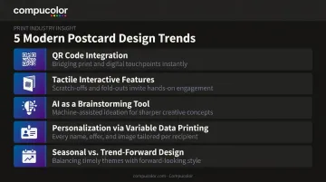
Static postcards still work, but interactive and personalized elements are pushing response rates and engagement further.
- QR code integration – Blend codes into the layout design, not slap them in a corner, and link to trackable, mobile-optimized landing pages.
- Tactile interactive features – Scratch-offs, punch-outs, fold-out panels, and multi-drop mailer series build anticipation; USPS recognizes embossing, spot gloss, and peel-and-reveal as qualifying tactile formats.
- AI as a brainstorming tool – Tools like ChatGPT, Canva, and Midjourney speed up concept generation, but a designer's eye still handles bleed, resolution, and postal compliance.
- Personalization through variable data printing – Unique names, offers, or images on each postcard boost response over generic mailers; Compucolor's variable data printing delivers this without slowing production.
- Seasonal vs. trend-forward design – Safe seasonal templates are easy but forgettable, while bolder, trend-driven palettes create standout campaigns worth the creative risk.
Postcard Design Ideas by Industry and Use Case
Different industries lean on different postcard strategies, and the strongest campaigns borrow from what's already proven in that space.
Real Estate
Sold-listing highlights, before/after property shots, and consistent agent branding build trust quickly. Buyers and sellers respond to proof, not adjectives. According to NAR's 2024 Profile of Home Buyers and Sellers survey, 8% of agents reported using direct mail, including postcards and flyers, as part of their marketing mix.
A recent sale in the neighborhood is often the single most persuasive image you can put on the front of a card.
Events, Nonprofits, and Higher Education
Save-the-date formats work for events and reunions. Nonprofits lean on emotional storytelling tied to a specific cause and a clear donation ask. Colleges and universities often use campus-life energy, photos of students, quad shots, game-day scenes, for open houses and homecoming mailers.
Political Campaigns and Publishers
Postcards remain a cost-effective, fast-read tool for voter outreach and subscription promotions. A clean headline and a single call to action (vote, renew, subscribe) tend to outperform text-heavy alternatives. Compucolor works with publishers on subscription and renewal mailers, where quick turnaround and print quality matter as much as the message itself.
From Concept to Mailbox: Choosing the Right Printing Partner
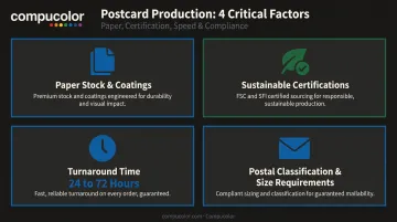
A great design can fall flat if the print execution doesn't hold up. A few production factors matter more than most marketers expect.
Paper stock and coatings directly affect how colors and textures translate from screen to print. UV coating, for example, adds gloss, scuff resistance, and visual depth, but it needs to be matched correctly to the design and stock or colors can shift unexpectedly once printed.
Sustainable, certified printing reinforces a brand's environmental values, but only if the printer holds real certifications. Look for Sustainable Forestry Initiative membership and other recognized responsible sourcing certifications, not just a green-sounding label.
Compucolor holds both certifications, giving brands a paper trail that backs up their own sustainability claims.
Turnaround time is often the deciding factor for campaigns on a deadline. A one-stop service that handles design, printing, and mailing under one roof avoids delays caused by juggling multiple vendors.
Compucolor's in-house creative team and direct mail fulfillment services support turnaround windows of 24 to 72 hours, a critical edge when a campaign date isn't moving.
Turnaround speed means little if the finished piece gets rejected at the post office. Before finalizing any design, confirm postal classification too. Size and thickness determine whether a card qualifies for retail postcard postage or falls into a different commercial mail category, and that affects both cost and layout space.
Frequently Asked Questions
What is the standard size for a marketing postcard?
The most common USPS-compliant sizes are 4 x 6 inches for retail postcard rates and up to 6 x 9 inches for commercial mail categories. Larger sizes give you more design space but usually cost more in postage.
How can I make my postcard stand out in someone's mailbox?
Lead with bold, high-contrast color and one clear message. Then add an unexpected touch, such as humor or a tactile finish, so the card feels different from everything else in the stack.
Should I include a QR code on my postcard?
Yes, as long as it's placed intentionally and links to a relevant, trackable landing page. A code that feels tacked on or leads somewhere generic won't get scanned.
How much text should be on a postcard design?
Keep it minimal and focused on one clear offer or message. Detailed information belongs on your website or landing page, not crammed onto the card itself.
What paper finish works best for postcards?
UV gloss coating adds shine and durability, making colors pop for bold, photo-driven designs. Matte finishes offer a softer, more premium feel that works well for minimalist or upscale branding.
How far in advance should I order postcard printing for a campaign?
Standard runs can often turn around in 24 to 72 hours with the right print partner. Large runs or complex finishes like die-cuts or scratch-offs need extra lead time, so plan a few weeks ahead when possible.