
That's the power of die-cutting. In a mailbox stuffed with flat, forgettable inserts, a custom-shaped edge or a peekaboo window stops the hand before it reaches the recycling bin. It's tactile marketing that works because it engages more than just the eyes.
This guide breaks down what die-cut brochure shapes actually are, the three main categories used across the industry, and how to pick the right one for your next campaign without blowing your budget on complexity you don't need.
Key Takeaways
- Die-cut brochures use shaped edges, windows, or functional cuts for tactile, memorable pieces
- Three categories exist: edge/silhouette cuts, window/reveal cuts, and functional/interactive cuts
- Your choice depends on goal, paper stock, distribution, and budget
- Precision equipment and in-house design reduce misalignment and costly reprints
What Is a Die-Cut Brochure Shape?
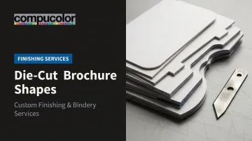
Die-cutting works like a cookie cutter for paper. A custom steel blade, called a die, presses through printed sheets to create shapes beyond the standard straight edge. Instead of a rectangle, you get curves, notches, windows, or entirely custom silhouettes.
On a brochure, that cutting can happen in three places:
- The outer edge: reshaping the entire silhouette of the piece
- The interior: cutting windows or openings that reveal what's underneath
- Functional points: adding tabs, slits, or pockets that make the piece do something
Industries from retail to political campaigns to point-of-purchase displays use die-cutting for the same reason: it turns a passive handout into something people want to pick up and hold onto.
Why Tactile Print Still Matters
This isn't just a design trend. Canada Post's 2015 neuromarketing study tested 270 participants using EEG and eye tracking. It found that direct mail generated 70% higher brand recall than digital media, required 21% less cognitive effort to process, and produced 20% higher purchase motivation.

That data speaks to physical print broadly, not die-cutting specifically. But it makes the underlying case: paper you can feel outperforms screens you scroll past.
Without thoughtful die-cutting, brochures blend into the pile. They get sorted, skimmed, and tossed. Never opened, never remembered. A well-placed cut interrupts that pattern before a single word gets read.
Types of Die-Cut Brochure Shapes
Die-cut shapes aren't interchangeable. Each category serves a different marketing job, and matching the wrong one to your goal wastes budget on complexity that doesn't deliver results. Here's how the three main types break down.
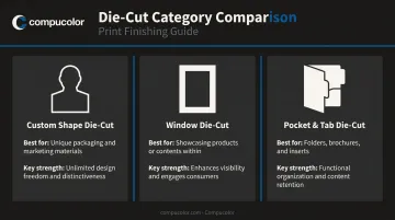
Edge & Silhouette Die-Cuts
This is the most visually dramatic option. Instead of a straight rectangular trim, the die follows a custom contour, reshaping the entire outer profile of the brochure. Think wave-edged panels, a product outline, or a logo-shaped silhouette.
How it's different: Unlike window or functional cuts, edge die-cuts change the whole outer form, not just an internal detail.
Best suited for:
- Brands chasing instant shelf or mailbox recognition (a rooftop outline for a roofing contractor, a car silhouette for a dealership)
- Retail launches and high-visibility campaigns where shape alone reinforces recall
Key strength: Strong brand association even before the reader glances at the copy.
Trade-offs:
- Custom dies require upfront tooling investment
- Complex silhouettes can bend or crease in transit if the paper stock isn't heavy enough
Window & Reveal Die-Cuts
Here, the outer shape stays a standard rectangle. The interaction happens inside: a shaped opening cut into the cover lets part of an image, headline, or offer peek through before the piece is fully opened.
How it's different: No change to the outer silhouette. The curiosity comes from what's revealed underneath.
Best suited for:
- Teaser campaigns and product reveals
- Event invitations built around a "what's inside" moment
Key strength: Builds anticipation, which pushes recipients to physically open the piece instead of setting it aside.
Trade-offs:
- Requires exact registration between the cut and the printed layer beneath it — even small misalignment looks sloppy
- Lightweight stock tears easily around delicate window edges
This is also a category the U.S. Postal Service recognizes directly. Its Domestic Mail Manual permits die-cut openings in folded self-mailers, provided the enclosed insert is larger than the opening so it can't shift or escape during handling.
Functional & Interactive Die-Cuts
This category is built around usability, not just visual impact. Tabs, slits, pockets, pull-outs, and pop-up folds all fall here, placed strategically at fold lines or panel edges.
How it's different: Purely decorative cuts stop at looking good. Functional cuts have to hold something, guide navigation, or trigger movement when the piece opens.
Best suited for:
- Multi-panel brochures and media kits with inserts
- Catalogs needing a business-card pocket or a memorable unboxing moment
Key strength: Combines practicality (holding a card or a spec sheet) with a tactile "wow" that pure print can't match. Compucolor's Mueller Martini bindery equipment handles these multi-step folds and pockets in-house, keeping turnaround fast even for complex builds.
Trade-offs:
- More complex bindery steps add production time and cost
- Every fold and pocket needs testing to confirm it still closes and holds inserts securely after cutting
How to Choose the Right Die-Cut Shape for Your Brochure
The right die-cut shape depends on your goal, your stock, and how the piece will reach your audience, not on which cut looks flashiest.
Match the Cut to Your Goal
Ask what you're solving for:
- Brand recognition → edge or silhouette cuts
- Curiosity and engagement → window or reveal cuts
- Usability → functional or interactive cuts
Factor In Distribution and Stock
If you're mailing the piece, sturdier construction matters more than the design alone. USPS specifies that mailed self-mailers with die-cut openings need 100 lb paper for pieces up to 1 ounce and 120 lb for anything heavier.
Automation-compatible letters also have minimum size and thickness rules. An irregular silhouette may need an approved alternative design template rather than standard letter processing.
Beyond mail requirements, a few production basics apply across the board:
- Heavier cover stocks (80–100 lb+) hold crisp cuts better and resist tearing around windows or intricate silhouettes
- Fold with the grain, not against it, to avoid visible cracking at the crease
- Budget for die tooling: custom dies cost more upfront but are reusable across future runs of the same shape
- Account for complexity — more panels and alignment points mean more chances for registration issues
Prototype Before You Commit
Before greenlighting a full production run, get a physical mock-up made. It's the only way to check fold integrity, cut alignment, and how the piece actually feels in hand — something no digital proof can tell you.
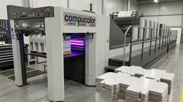
This is where working with a printer that has in-house creative services and precision equipment pays off. At Compucolor, our Komori LS 40 press with H-UV coating supports tighter die-cut registration on cover stock. This precision cuts down on the kind of alignment drift that turns a good design into a costly reprint.
Common Mistakes to Avoid Before Finalizing Your Die-Cut Design
Most die-cut problems trace back to a handful of avoidable decisions made early in the design process.
Overdesigning the cut. A complex silhouette or interactive pop-up isn't automatically more effective. If a simple window achieves the same brand recall for a fraction of the cost, use the window.
Ignoring stock limitations. Intricate cuts on lightweight paper curl and tear. Match the paper weight to the complexity of the design before finalizing artwork.
Overlooking mailing constraints. Irregular shapes can fall outside standard postal handling. Die-manufacturing tolerance runs about +/-0.005 inch, according to PRINTING United Alliance guidance. Cutting-rule deflection can push real-world variance closer to +/-0.010 inch in production, a margin that matters when a design needs to clear postal equipment cleanly.
Skipping the prototype. Moving straight from digital proof to full print run is where most expensive mistakes happen. A physical sample catches misaligned windows and folds that won't close properly, before you've printed thousands of copies.
Conclusion
Die-cut brochure shapes turn a flat handout into something people notice, touch, and hang onto. Edge cuts drive shelf recognition, window cuts build curiosity, and functional cuts add real usability — each one solving a different marketing problem.
The right choice comes down to matching the cut to your paper stock, your budget, and how the piece will travel from press to hand. Get that alignment right, and you've got a brochure worth keeping instead of tossing. A print partner like Compucolor, with an in-house design team and dedicated die-cutting equipment, catches problems before they turn into costly reprints.
Frequently Asked Questions
What is a die-cut brochure?
It's a brochure where a custom steel blade cuts shapes into the paper's edge, interior, or folds, creating a visual or functional feature beyond the standard rectangle. The cut can reshape the outer silhouette, reveal content through a window, or add tabs and pockets.
What is an example of die-cutting?
A common example is a brochure cover cut into a product silhouette, like a car outline for an auto dealer. Another is a window cut into the cover that reveals a headline or image printed on the panel underneath.
What is a 3-page brochure called?
"Three-page" is a misnomer in print terms; brochures are counted by panels, not pages. A letter-fold sheet creates six panels, a bi-fold makes four, and three visible sections on one side make a tri-fold or three-panel brochure.
How much does die-cutting add to brochure printing cost?
Custom die tooling adds upfront cost, but the die is reusable for future print runs of the same shape. Simple edge or window cuts cost less than intricate multi-cut or interactive designs that require extra bindery steps.
What paper stock works best for die-cut brochures?
Heavier cover stock, generally 80–100 lb or higher, holds crisp cuts and resists tearing, especially around windows or intricate silhouettes. For mailed pieces, USPS requires 100 lb paper for pieces up to 1 ounce and 120 lb above that.
Can die-cut brochures be mailed?
Yes, but the design has to meet the requirements for its mail category. That can mean using a compliant envelope, an approved alternative letter design, or sturdier stock so the piece survives postal handling equipment without tearing or jamming.